Saturday, November 21, 2009

Beside Still Waters


beside still waters
pastel on wallis paper 9"x18"
framed approx. 18"x26"


Recently I've been displaying some of my artwork through the local art league, and through the community art program. Last month I was excited to find that I had sold 2 pieces.

This painting will be part of the member's show that will be up through the end of the year. I started it on location in a beautiful, peaceful spot in the nearby wetlands area, but finished it in "the studio".

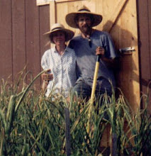
My husband has been making these fine cherry frames which are a very nice color to set off the painting, and he'll make any size I need, in a day. Lucky me!

Wednesday, August 19, 2009

fence row

fence row with ironweed
pastel on uart paper


untitled

untitled
pastel on board 5x14

I've been away from blogging for quite some time now. I've found that looking at lots of other people's work, while fun, is sometimes confusing for me. It's great in small doses though.

My husband has been making frames like crazy and I'm getting some pieces together for the great little community art league here in our town. I'm planning to put up eight or so pieces in a public place as part of the community art program. An exciting first step for me.

This is one that I had set aside and forgotten about. But here it is resized (I cut the bottom off), the foreground reworked, and I'm happy with it- looking across the cow pasture at the little piece of woodland that we own in southeast Missouri. It was dusk and getting cold.
Pastels really glow in person, and that just doesn't always come through on the computer monitor.

Friday, June 26, 2009

Oregon river rocks

Oregon River Rocks
pastel on wallis paper


I finally got back to painting today. Having been gone the past 6 weekends, there wasn't much time to paint, except for the pastel workshop of course. This one was started at the workshop and finished up today.

I enjoy painting rocks. It's almost like sculpting. You add a little shadow and the form of the rock changes.
Water is fun too. There's so much color in it.
Foliage is a struggle, as always. I just feel lucky when it turns out right.

Wednesday, May 27, 2009

Albert Handell workshop in Oregon

Grant's Pass Water Dept.
pastel on Wallis paper 12"x18"

I just spent a week in Grant's Pass Oregon, visiting my sister and taking part in a pastel workshop with Albert Handell. It was a wonderful experience in every way. I'm still jotting down little things I learned as they come to mind- not so much technique as how to see and compose a beautiful painting.
This is one of the paintings that I did during the workshop. I was particularly happy with this one because one of the things I was hoping to work on was how to handle all the green that surrounds us in the summertime. You can only avoid it for so long...

Friday, May 15, 2009

spring creek

spring creek
pastel on uart paper 9"x12"


A painting done on site at the park near my house. I was happy to find this little out of the way creek with a plank bridge in just the right spot. It was a nice place to set up my easel and be off the beaten path. (I have a hard time painting with lots of onlookers.)

Thursday, May 7, 2009

haybale

Haybale
pastel on paper 9x12-ish


Well I've been avoiding my blog for a couple weeks, but wanted to post something while I'm working on another piece. So here is one of my older paintings. It's always been one of my favorites although I'm sure the composition would bother some people.
Haybales are a nice thing to paint, all big and round, although I do sometimes miss the square ones.


Thursday, April 23, 2009

Nebraska twice

Nebraska again
pastel on Uart 800 paper 6.5"x9"


Nebraska 1st painting
pastel on Canson paper 10"x19"


I thought it might be fun to post the first pastel that I ever did. I had a cheap little box of Mungyo pastels ($6 at Hobby Lobby?).
I decided to try painting the same scene again. Funny thing is, I'm not really sure which one I like better.
I'm also not 100% sure that this was in Nebraska. If it is, it's northwest Nebraska, close to Wyoming or Montana. We covered lots of states on that road trip. It's beautiful out there.

Tuesday, April 21, 2009

charcoal sketch


David at the creek
vine charcoal on paper


Gee, I've been having a hard time painting lately. I sat down and started this sketch to help me decide if I wanted to do a pastel of my husband. I do landscapes, not people. Well, it does look like him except that he's 6'4" and this makes him look more like 6'.
I still haven't mustered up the courage to start the pastel version.
I've never spent much time drawing. This vine charcoal is nice stuff. Really black, and it moves around and erases easily. And amazingly it doesn't come off on your hands. I'm a messy artist so that's a good thing.

Tuesday, April 14, 2009

the colors of fog

the colors of fog
pastel on board 3"x5"

Another four hours on the interstate yesterday, and another picture from memory. I was so annoyed with myself for forgetting to bring my camera, so I worked real hard at trying to remember something about the way the clumps of trees looked in the fog. But the most beautiful part was the colors. The lavender sky made the grasses glow all orangy pink.
I didn't really want to paint this evening, and started out trying to rescue a painting I started over the weekend. I don't often give up on a painting, but that one is filed away, probably forever. Not wanting to quit on a bad note, I did this one. I think I did it in 10 minutes and then quit, because I want to go sit by the woodstove and knit.

But first, I'd like to mention that I was recently tagged by Jala Pfaff, who is a talented artist and feels like a friend because she so faithfully stops by my blog and leaves encouraging notes. If you aren't already familiar with Jala and her lovely paintings, please visit her blog. She does amazing things with vegetables, locks and other interesting subjects.
I was also tagged earlier by Karen, and never got around to fulfilling by tagging duties. She is also very talented and does some delightful little landscapes. You can see them at A Visual Journey.

Some other artists that I want to mention (or tag) are:

Jeff at 120 Paintings who has been a source of inspiration (and information) to me
George Coll Daily Paintings who does small landscapes with wonderful color
Margaret Dyer, also a pastelist who does very expressive studies of people
Susan Downing-White paints Gulf Coast Flora
Joie de Vivre has a great chair series
Myra at I Want To Be An Artist who paints nice little dancers

These are just a few that came to mind. There are many more. The art blogging community has been such a good thing for me. I'm glad you are all here. Thanks.


Friday, April 10, 2009

shadows on the path

shadows on the path
pastel on Uart600 paper, 7.5" x8.5"

A painting that I started and put aside for a week or so. Most of the ground work was done quickly on site. I finished it up today and it's cold and rainy. It was nice remembering this warm sunny day.

I realized that I use a lot of trial and error when I paint. Sometimes it's a very hard decision as to which color I'm going to pick up out of the box and use. Sometimes it's just really pretty haphazard- almost unconscious, or maybe a little intuitive. And I'm not talking about the choice between 2 very close shades of green, but more like, am I going to use this blue or that red? I'd like to find a good book on color. Any suggestions?

One very basic way that I think I'm improving as an artist is that I notice sooner when something isn't working, and I stop trying to make it work.


Monday, March 30, 2009

fence row

fence row
pastel on uart paper 9x12

We had an extended weekend trip to our little country get-away and it included all the elements of spring. Blooming things everywhere, a hit of green in the treeline, enough rain to cover the low-water bridge, warm sunshine, cool nights, amazing blue skies with big puffy white clouds, and never enough time to take it all in.
Our little piece of property has a beautiful stream with a great swimming/fishing hole on the low side and a hilltop with a view of the distant hills on the high side. It's lovely and I'm so grateful to my parents for passing it on to us.
I don't know if I'll ever run out of things to paint there.

I'm always saying this, but I don't really feel like this one got finished. There were too many things to do, and I get impatient. The big straight tree towards the right bothers me. Too heavy I think.

Wednesday, March 25, 2009

raincloud on my drive home

raincloud
pastel on uart paper 3"x5"

Hmmm, another not so serious attempt to make a painting. Hopefully I'll get down to business in the next couple of days.
I did this mostly from memory of this big gorgeous thundercloud. It was hovering just ahead of me as I drove home on the interstate after a nice visit with my mom, dad and brother. It never did rain, at least not on me.

Monday, March 23, 2009

mourning cloak

mourning cloak study
pastel on uart 800 paper 5.5"x9"


A few days ago, in the middle of the night, or very early morning I woke up with this picture in my head. No idea where it came from. It's not what I usually paint although I had been thinking about beetles. So, after a few more days, I decided I better arrange some pigment on paper to resemble the picture in my head. The one in my head is better, so I'll call this one a "study" and hopefully try again later.

The
Mourning Cloak butterfly has ragged wings and is often the first butterfly seen during the year. It overwinters as an adult, and can be seen on warm days as early as January. (from Illinois Insects and Spiders by Peggy Macnamara)

I found the Uart 800 to be too fine. It doesn't hold any pastel at all. It would be useful I suppose if you only worked in hard pastels or pastel pencil.

Saturday, March 21, 2009

the gravel road

the gravel road
pastel on Uart sample 3"x5"


I previously did a small oil version of this scene, in a square format which I preferred. Here is a very small pastel version, a late night, just-gotta-get-my-fingers-dusty little painting.

I'm trying out a new paper-Uart. This is my first experience with it done on a little sample sent to me my an art supply store. (I confess, I photoshop-ed the staple holes out of it.) So far I like it a lot, but then this is a very small piece. I'm wanting to do more watercolor underpaintings and I think it will work well for this. It also gives you options about how "gritty" you want your surface to be. I'm looking forward to doing some experimenting on larger sheets.


Tuesday, March 17, 2009

winter waterway

winter waterway
pastel on paper 9"x12"


I ordered some new colors to fill in some gaps in my pastel box and they arrived just in time since I was about half finished with this picture. I like to order individual pastels in colors that I've been feeling a need for. Usually it's not long before I wonder how I got along without them. This may not be finished. It feels like it's still in process. If it changes significantly, I'll post it again.

And here is a picture of the nice pastel box that my husband built for me. It's made of mahogany and birch. He's quite a woodworker, huh? You should see the beautiful frames that he builds when I paint a picture worthy of it. The box has a lid that fits snugly and is held on by a couple of elastic and velcro straps. I didn't want a lot of buckles or handles to catch on things. It fits nicely in a daypack so that I can take it along easily. This was taken before the new pastels, the last time I sort of cleaned it up a bit. I'm always curious about other artists' setup, so I thought maybe folks would like to see it.


Friday, March 13, 2009

my first million years

Wetlands Willows
pastel on wallis paper 4.5"x7"


I keep going back to these scenes from the large wetlands area nearby. I guess because I'm trying to find fairly simple uncomplicated compositions. And it's such a peaceful place. After spending the morning in traffic court with my son, this was just what I needed today.

In his book Painting As A Pastime, Winston Churchill talks about how painting calls new brain cells into activity, giving the tired parts of the mind rest and refreshment. How true!

And while I'm on the subject, here is another quote from Winston Churchill
.
I must say I like bright colours. I agree with Ruskin in his denunciation of that school of painting who 'eat slate-pencil and chalk, and assure everybody that they are nicer and purer than strawberries and plums.' I cannot pretend to feel impartial about colours. I rejoice with the brilliant ones, and am genuinely sorry for the poor browns. When I get to heaven I mean to spend a considerable portion of my first million years in painting, and so get to the bottom of the subject. But then I shall require a still gayer palette than I get here below. I expect orange and vermilion will be the darkest, dullest colours upon it,and beyond them there will be the whole range of wonderful new colours, which will delight the celestial eye.


and then I started scribbling....

untitled
pastel on wallis paper 9x12"


I worked on this way too long, and then put it away so I wouldn't have to look at it anymore. But, it was nagging at me. So, I got it back out, saw some things wrong with it and did some quick, scribbling "repairs". I'm pretty sure that I'm done with it now. I've worn it out. Ready to move on.
But that's ok because I have more paper, more pastels and a free day tomorrow.

Thursday, March 5, 2009

a little something for my sweetie...

garlic field
pastel on wallis paper

It's been a hellacious week, but I now have a few days off and hope to get back to painting. It was probably 70 degrees here today, and I'm hoping this great weather lasts at least a few more days.

I did this little pastel for my husband who loves garlic above almost everything. This might be the year we grew 5,000 heads of it. These days we grow a more reasonable 500 heads.
I did this painting on a tired brain, and didn't take it too seriously. It probably needs some tweaking, and certainly the photo does (too blue), but I wanted to post something this week. Honestly, I was hoping for something a little more Susan Ogilvie-ish.


Saturday, February 28, 2009

supporting the arts

hilltop shadow
pastel on Wallis paper 7.5"x9.5"


Well, it's the last day of February, and I met my goal of painting every day, even though I didn't complete a new painting each day. And there were a few I didn't post. It's been such a good thing for me. I hope to keep up the daily, or near daily consistency.


This weekend our town, Columbia Missouri, is hosting an annual Documentary Film Festival, called the True False Film Festival. It has become quite a huge event, attracting thousands of people each year, and requiring hundreds of volunteers. I'm happy that I got to be one of them this year and support the arts in another way. And I get to see lots of amazing films. It has made it a little difficult to paint the last couple of days, but I'm pretty happy with this one.

Happy March everyone. Spring is coming!

Tuesday, February 24, 2009

cedar grove


cedar grove
pastel on Wallis paper 7"x7"
sold

This quick sketch was done from a photo taken the other day, just down the hill from the sunny happy place.
Cedars are the only green thing around right now, which is kind of a relief really. I've always had a hard time "capturing" cedar trees. The deep dark shadows and those highlights- gold, russet, sometimes almost red, sometimes yellow-green.
The sky really was an intense blue that day.


Top of the Hill

Top of the Hill
oil on board 6"x6"


This painting was done yesterday, just couldn't get around to doing the blog thing last night. What a wonderfully sunny day we had here for the end of February. A great opportunity to get out and paint. I took my oils and found the sunniest spot I could find.
Even though, on first glance, everything around here looks brown and yellow this time of year, the sun was exposing all kinds of pinks and oranges in the distant treeline. This is a little greeting card-ish, but heck, it was just me and my paints in a sunny happy place.
I have a several new art books, and am reading one by Kevin MacPherson to help me understand oils a little better. It's very helpful so far.

Sunday, February 22, 2009

Belize sunrise


Belize sunrise
pastel on paper


Sunrise, always changing, always different. Sometime I think I will paint only skies for a month or so. What a challenge. But I did have fun on the clouds.


Friday, February 20, 2009

Beyond pretty

Bishop canal
pastel on Wallis paper 5.5"x8.5"


In the town of Bishop, California there is a canal that carries water from the mountains to the big cities, and there are nice trails on both sides for walking, biking. The town of Bishop lies in a valley between the Sierra Mountains and the White Mountains. Lots of material for artists there!
I'm trying to think more about composition in my paintings. I started reading Mastering Composition by Ian Roberts. Very helpful so far, and I've only read chapter one. He talks about different "armatures". I guess you would say it is the form of the composition, such as "S", "L", diagonal, radiating lines, fulcrum, etc. I realized that I'm often stuck on "L".
Especially in the world of landscapes, there are plenty of "pretty pictures" out there. I want to learn to paint in a way that makes an impact beyond pretty.
I was attracted to the shapes in this scene created by the water, and the strong shadows.


Thursday, February 19, 2009

fall grasslands pastel version

fall grasslands pastel
pastel on Wallis paper 6"x9"
sold

This is the same scene that I painted in oil a few days ago. I added some vertical elements to hopefully improve the composition. I feel that both photos have turned out too orange. The paintings are not quite so orange though they may need some lighter golden tones. I was having trouble coming up with a luminous color that wasn't too bright. Gee, I may need to buy more pastels. :)
These grassland areas are the Missouri River bottomlands that flooded so badly in '93. Now it is a wetlands project. Waste water is channeled there to be naturally purified. You can see tons of birds there. Geese, ducks, eagles, herons, egrets...


Wednesday, February 18, 2009

waiting

waiting
pastel on colourfix paper 9"x12"

This little scene is painted from a photo I took while in Guatemala. If the sweet little Mayan woman looks really short, it's because she is. The colors, the people, the scenery there are all so beautiful.
This was a very different subject for me. I don't usually include people in my paintings.
It's nice to be back to pastels today, after some experimenting with oils. I feel more at home with them, which is a nice feeling.
Before taking up pastels I painted with watercolors for a few years. My husband and I took the train to Santa Fe two (or is it three?) years ago for our anniversary, and that's where I first saw the incredible pastels that sparked my interest in this medium. I didn't know anything about it before that, and have been learning what I can from books and lots of trial and error.
I just bought an instructional video with Albert Handell demonstrating. I love his work. I'm considering going to one of his workshops and would love to hear from anyone who has been to one.

Monday, February 16, 2009

fall grasslands

fall grasslands
oil on panel 9"x10"


This is the one I said I wouldn't post. But it's what I worked on today, and after all it's not about showing off. Back to pastels tomorrow.


small bird

small bird
pastel on Canson paper

This painting is from 2 days ago. A fat little bird. I believe it's a sparrow.

I don't really like Canson paper, but I can work on it without the worry of ruining a "good" piece of paper. And since I was on the road, I packed light and took a few sheets of paper and my box of Rembrandt pastels, my first pastels. These days I use an assortment of Schminke, Unison, Great American and a few Mount Vision. I prefer Schminke for their buttery softness.

You will probably never see today's painting. I tried painting with oils again, and remembered why I love pastels. So, that's a good thing.

Sunday, February 15, 2009

driving by woods on a snowy evening...


Snowy evening
pastel on paper 6"x9"


...or Where I've Been This Weekend. Iowa. It is mostly cornfields, but there are some trees.

It was a little exciting driving through a snowstorm, and the snow really was beautiful.
I was also inspired to paint a snowy scene after looking at some great little paintings on Karen Phipps blog.
Another very quick painting for me. Under an hour. This has been very good for me because it used to take me months to complete a painting. It's good to keep moving on.

Thanks everyone for stopping by...


Thursday, February 12, 2009

the color of february

The Color of February
Pastel on Wallis paper 7.5"x11.5"

Last weekend I drove for a couple hours through the countryside and noticed again the beautiful colors that are everywhere this time of year- the dried grasses and the lavender sky and tree lines. It's wonderful how painting makes you aware of all the colors. The grass is no longer yellow, but thousands of shades of green, grey, yellow, pink, red.... It takes your breath away sometimes.

This scene is in southern Missouri where the hills are bigger.

Tuesday, February 10, 2009

pink path

pink path
pastel on Sennelier LaCarte paper 6"x6"

This picture definitely had a mind of it's own. It's not what I intended it to be, but somewhere in the process I decided not to fight it.
It became an exercise in seeing how slight differences in value can really shape a landscape
. I don't usually paint in the little-hatch-mark technique, but it is such an interesting way to layer and visually blend colors. It's nice that you don't ever feel that you've made a mistake, as almost anything can be covered with more layers of little marks.
Normally I have trouble keeping my fingers out of the painting (too much blending), but with this method the temptation isn't really there- it's easy to see how that would spoil the picture, so I'm happy to say my hands are clean.

Monday, February 9, 2009

Boonville Bottoms


Boonville Bottoms
pastel on Canson paper 4.5"x8"

Looking across the muddy Missouri River from the town of Boonville.
The river bottoms are flat and fairly featureless, but provide some interesting subject matter in terms of the bands of color, and the sense of space. There aren't many "long views" in Missouri, the kind that are so plentiful out west, so I enjoy looking out over the bottomlands.

Saturday, February 7, 2009

a joy ride in a paint-box


County Road
oil on board 7"x7"


When I was a kid, my mom had a group of friends that would come over and paint with oils, and smoke cigars. Thankfully, she let us dabble in her paints to our hearts content, but kept us out of the cigars. I often wish I'd never quit painting, but I did until well into adulthood. Perhaps I wouldn't be so afraid of that empty "cowering" canvas if I had continued to paint.
I love Winston Churchill's little book, Painting as a Pastime. It begins with this quote.
The first quality that is needed is Audacity. There really is not time for the deliberate approach. Two years of drawing-lessons, three years of copying woodcuts, five years of plaster casts- these are for the young... We must not be too ambitious. We cannot aspire to masterpieces. We may content ourselves with a joy ride in a paint-box. And for this Audacity is the only ticket.

I need more audacity, but I'm working on it.


Friday, February 6, 2009

Fallen Branch


Fallen Branch
pastel

I sat in the park and did 2 paintings of trees today. One oil and one pastel. We're having some amazing weather for February. I'll work on this some more, but wanted to post it tonight.

Thursday, February 5, 2009

untitled

Untitled
Pastel on Paper 5.75"x9"


This was an attempt to loosely interpret a photograph of some trees, with a more gestural quality. I've been following Casy Klahn's Tree School on his blog. Although we have quite different painting styles, I greatly admire his work, and there is so much to learn there. I am trying to incorporate some of his ideas in my paintings.

I'm finding pretty consistently that the parts of a painting that are easiest to paint, are the best parts. Or perhaps the truth is that some parts just come out right the first time, and so they are "easy", and I don't spend a lot of time reworking them. In this painting I struggled with the sky and the trees. The ground, the hills, came easy. Hopefully as I get more experience, and make better choices of color and value, more and more of the painting will seem easy or flow more naturally.

Tuesday, February 3, 2009

Wild Plums


Wild Plums
Pastel on paper 12"x16"


There was an abundance of these tart little plums this fall in Missouri. They were nicer to look at than they were to eat.
The plums were fun to paint, but the leaves were difficult and I didn't really enjoy painting them. I think it shows. I'm not sure I'd want to try anything like this again. There's a lot here that I'm not happy with, but I was ready to be done with it, at least for now.

I welcome suggestions and critiques of any of my paintings.


Monday, February 2, 2009

Snowbird

Snowbird
pastel on paper 5.5"x6.5"

Well it's only the second day of February and I'm already "cheating". I have been painting all afternoon, and there's no way it's a one day painting. So, here's the painting I did the last day of January.

These little guys are gleaners. They hang out under the bird feeder and pick up the seed that the other birds drop. They're especially beautiful when it snows.

Daily Painting #1


February Wetlands
pastel on paper 8.5"x11.5"

February 1st turned out to be a beautiful sunny day so my husband and I hiked to one of our favorite spots, the bluffs overlooking the Missouri River bottoms, a wetlands area.
I forgot to take my camera, which was good because it forced me to finish this on site. After getting home I decided that I may need to rework that crazy sky.
The bottom picture is the original version, the top picture has the reworked sky. What do you think? Although I often wish I could hit the "undo changes" button with pastel, this time I'm glad I did it. Anyway it's too late because the old version is literally dust in the wind.

Saturday, January 31, 2009

Gnarly Old Maple


Gnarly Old Maple
Pastel on board 9"x12"

This is my most recently completed pastel. I started it last summer on site, and had a hard time pulling it out and finishing it. I struggled with all the green in this scene.
I enjoy painting in this style, but what really pulls at my heart are paintings done in a much looser style.
When I was younger, we would swing out into the creek from a rope tied into this tree's upper branches.


Friday, January 30, 2009

february and what it's done already

Sierra and Sage
pastel on paper (3.5x4")


I dread February unless I'm going to escape to someplace warm and sunny, which I'm not this year. This shortest of months always feels like the longest.

So, i set a goal for 2 purposes-
to get through the February greyness.
to improve my painting.

The intent or goal is to paint daily. It may be a quick 15 minute painting, or more. Hopefully this will help me to loosen up in my painting and to get over the difficulty with starting new works.
I don't intend to be too hard on myself if I don't paint every single day.

This is the first warm-up painting. A 15 minute painting of someplace warm and sunny- the High Sierra in eastern California.